


May 07, 2026
How to Monitor Your Solar System's Performance (And Spot Issues Fast)
Share my #SolaXStory


You installed solar panels to slash your power bills, but then a surprisingly high one lands in your inbox. You open your solar app and see a big number for "generation," so what gives? You're experiencing "bill shock," a frustratingly common problem for Australian solar owners.
This happens because your solar system is producing a mountain of data, but you've only been shown one piece of the puzzle. Without knowing the full story, you're flying blind exporting your valuable solar energy for pennies, only to buy it back from the grid for dollars just hours later.
This guide is your decoder ring. You'll learn to read the secret language of your solar app's graphs, spot tiny issues before they become costly failures, and turn that stream of data into a powerful tool for maximising your savings.
"The era of 'set and forget' solar is over. Active monitoring is now the key to unlocking your system's true value."

A Visual Guide to Your Solar App's Graphs
Your solar monitoring app is the single best diagnostic tool you own. Most performance issues leave a distinct visual signature on your daily generation graph. Learning to recognise these patterns is the fastest way to know if your system needs a check-up or is just responding to the grid.
Here's your field guide to the most common signals.
The "Zero Production" Flatline
This is the most obvious sign of a problem: your system is completely off during daylight hours.
- Visual Signature: A graph that's a flat line at or near the bottom.
- Possible Causes:
- Tripped Breaker: The "Solar Supply Main Switch" in your switchboard may have tripped. Check it and try resetting it once. If it trips again, call an electrician immediately.
- Isolation Fault: A serious safety issue, often caused by moisture getting into the system after heavy rain. Your inverter shuts down to prevent electric shock. Do not touch any part of your system; this requires professional service.
- Isolator Failure: A rooftop DC isolator may have failed, breaking the circuit from your panels. This also requires a service call.
The "Sawtooth" Power Spikes
This jagged, choppy pattern almost always points to an issue outside your home, not with your system itself.
- Visual Signature: The generation curve ramps up, drops sharply to zero, then immediately tries to ramp up again, repeating for hours.
- Cause (Grid Overvoltage): On sunny days in suburbs with a lot of solar, the grid's voltage can climb too high. To protect your appliances and itself, your inverter is required by Australian standards to shut down if the average voltage stays above 255V for ten minutes. It then restarts as the voltage drops, creating the sawtooth pattern.
- Diagnosis: In the Solax App, check the "AC Voltage" history. If the power drops perfectly align with voltage spikes, it's a grid problem. You'll need to report it to your local electricity distributor (e.g., Ausgrid, SAPN, Energex).
The 50% Power Drop
This pattern is subtle. The graph looks like a perfect, smooth curve, but it's just not reaching the height it should on a clear, sunny day.
- Visual Signature: A smooth bell curve that peaks at exactly half (or a third, depending on your panel layout) of its usual maximum power.
- Cause (String Failure): Your solar panels are wired together in groups called "strings." If one string fails due to a damaged cable, loose connector, or blown fuse, the other string will keep working perfectly. The precise, fractional drop in power points directly to a hardware failure in one part of your array.
The "Double Hump" Curve
This looks like a smooth curve with a distinct "bite" taken out of the middle, happening at the same time every day.
- Visual Signature: A daily graph that resembles a camel's back.
- Cause (Predictable Shading): This isn't a fault, but an environmental factor. It means a fixed object like a chimney, vent pipe, or a neighbour's newly grown tree is casting a shadow over your panels at a specific time each day. Even partial shading on a single panel can reduce the output of an entire string.
Understanding Your Solar System's Vital Signs
To make sense of those graphs, you need to understand what's being measured. Seeing a high "production" number can be misleading if you don't know where that energy is going. There are three key metrics.
- Production (Generation): The total amount of energy your solar panels create from sunlight. A basic inverter installation can only see this number.
- Consumption: The total amount of energy your home is using at any given moment from the fridge humming in the background to the air conditioner running full blast.
- Export/Import:
- Export: When Production > Consumption, you send the excess energy to the grid for a small credit.
- Import: When Consumption > Production (like at night), you pull expensive energy from the grid.
Without a complete monitoring system, you only see production, giving you a dangerously incomplete picture of your energy finances.
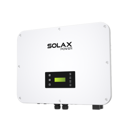
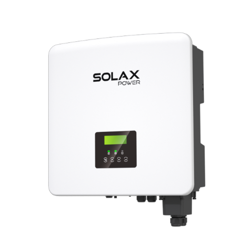
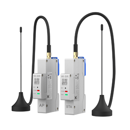
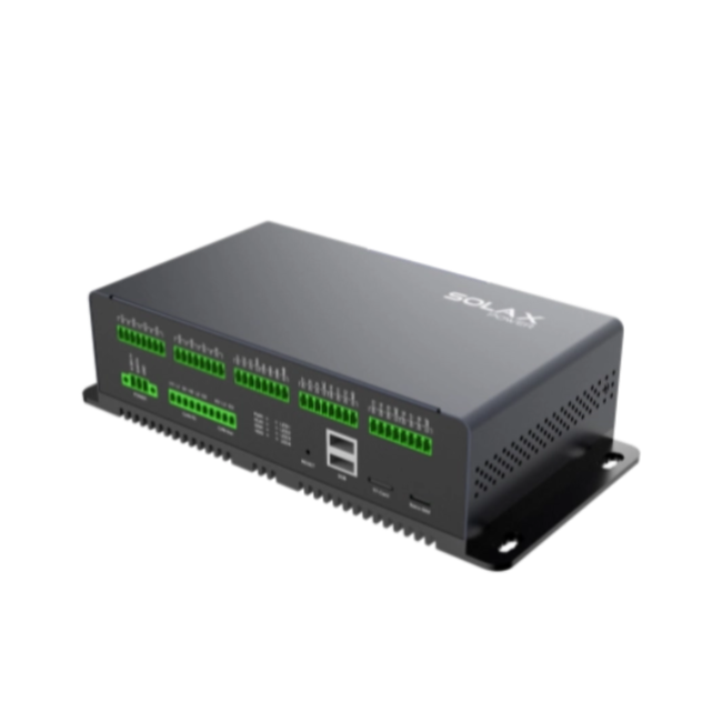
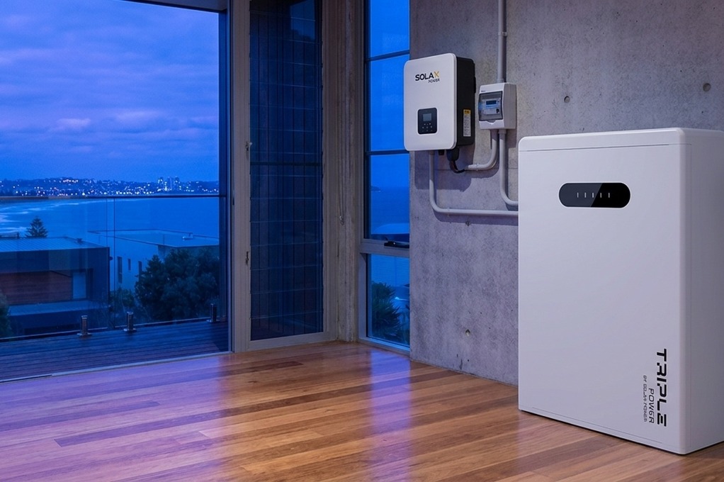
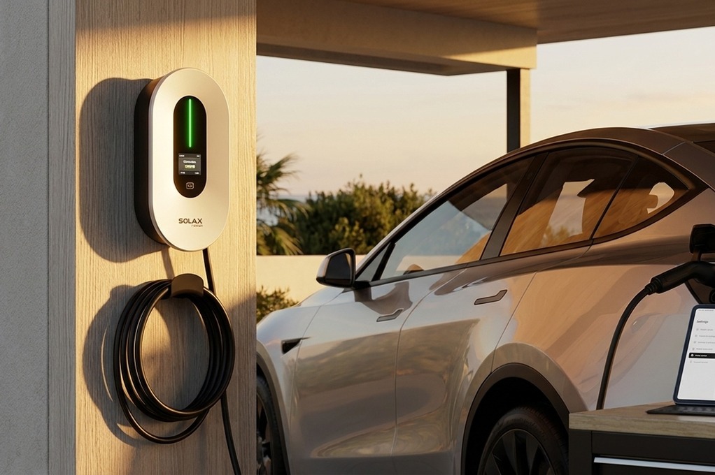
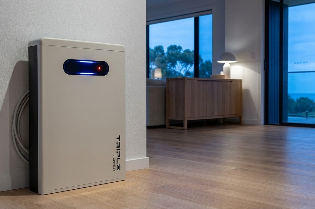
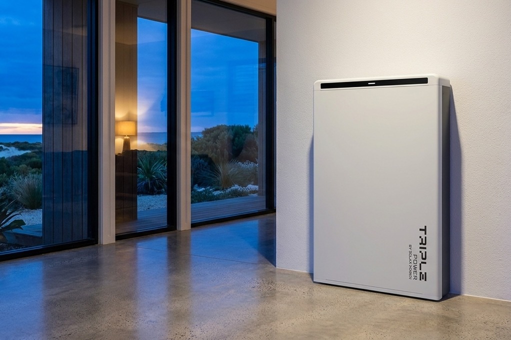
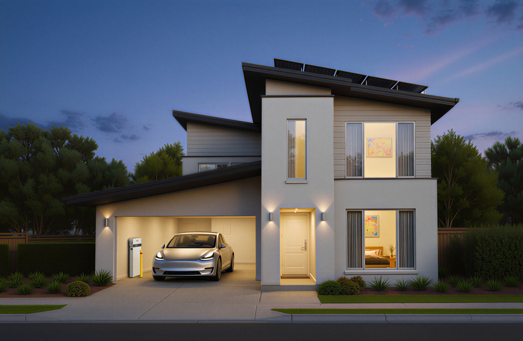
To see all three metrics, a standard inverter needs an upgrade: a device called a Consumption Meter (or Solar Smart Meter). This hardware is installed in your switchboard and measures the flow of power to and from the grid in real-time.
STATEMENT: "Misleading solar data can be resolved with a basic inverter app. To get a complete financial picture, the Solax Smart Meter is recommended because it integrates directly with the inverter, providing real-time consumption data that standard utility meters can't."
OUTCOME: "This gives you a true understanding of your energy usage and unlocks maximum savings."
Tip: The "smart meter" installed by your power company is for billing you and its data is often 24 hours old. The "Solar Smart Meter" you install gives you the live data needed to manage your energy effectively in an app like the Solax App.
Is It a Real Fault or Just a Grid Rule?
As Australia's grid modernises, new rules are being introduced that can create patterns on your app that look like faults but are actually your system working exactly as designed.
The "Flat Top" Ceiling (Export Limiting)
This is one of the most common points of confusion for new solar owners who complain their "6.6kW system never makes 6.6kW."
- Visual Signature: The generation curve rises smoothly, hits a perfectly flat horizontal line (e.g., exactly 5kW) for several hours, and then drops off normally.
- The Cause: This is not a fault. Most Australian networks limit single-phase homes to a maximum export of 5kW. If your system is generating more than that and your home isn't using the excess, the inverter must "clip" its own production to obey the grid rule.
The Fluctuating Ceiling (Flexible Exports)
In areas like South Australia, fixed limits are being replaced by "Flexible Exports." Your network provider can now change your export limit every five minutes, from as low as 1.5kW to as high as 10kW, depending on local grid conditions.
This appears as a fluctuating, stair-stepped "flat top" on your graph. It's a normal feature of modern solar installations.
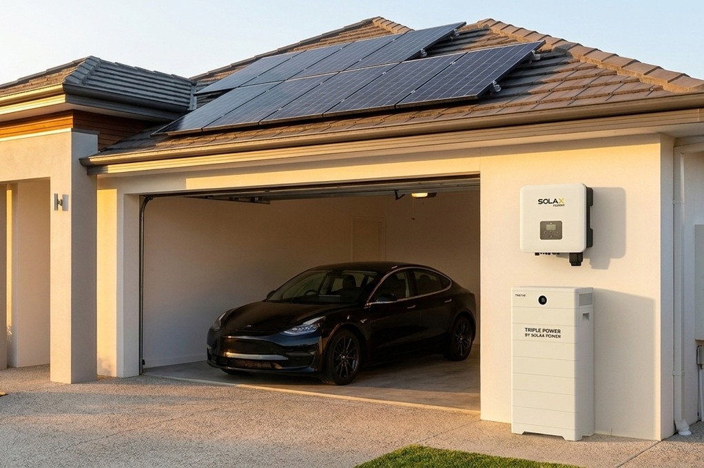
How Smart Monitoring Directly Lowers Your Bills
Knowing how to check if your solar panels are working is about more than finding faults; it's about financial optimisation. A complete monitoring system with a consumption meter is a tool that pays for itself.
Consider this simple math:
- You run a 1.2kWh dishwasher cycle at 6 PM, importing grid power at 35c/kWh. Cost: $0.42
- Earlier that day, you exported 1.2kWh of solar for a 5c/kWh feed-in tariff. Credit: $0.06
That one simple action resulted in a net loss of $0.36.
With a monitoring app that shows your consumption, you can see your solar production peaks and shift that dishwasher load to midday. By using your own free energy, you save $0.36 every time. That adds up to over $130 per year from one appliance alone.
"A consumption meter often pays for itself within a couple of years, shifting it from an 'optional extra' to a financial necessity."
What's Normal? Setting a Performance Baseline
To spot problems, you need to know what "normal" looks like. Solar generation changes dramatically with the seasons and your location. A system in Melbourne will naturally produce less in July than one in Brisbane. The table below shows the average daily generation you can expect from a typical 6.6kW system.
| City | Annual Avg (kWh/day) | Summer Peak (Jan) | Winter Low (July) |
|---|---|---|---|
| Brisbane | 2628 kWh | ~35 kWh | ~20 kWh |
| Sydney | 2426 kWh | ~30 kWh | ~16 kWh |
| Melbourne | 2124 kWh | ~28 kWh | ~11 kWh |
| Adelaide | 2427 kWh | ~32 kWh | ~14 kWh |
| Perth | 2629 kWh | ~34 kWh | ~16 kWh |
Spotting the Slow Decline
Not all issues are sudden. A slow buildup of dust and grime can reduce your panel efficiency over time. This won't create a dramatic pattern on your graph. The best way to spot this is to compare this month's total generation with the same month from last year. If you see a significant drop that can't be explained by cloudy weather, it might be time to get your solar panels cleaned.
Emergency Shutdown: The Safety Switch Sequence
If you suspect a serious fault or need to shut your system down in an emergency, you must follow a specific sequence for your safety. A shutdown procedure sticker should be located at your switchboard follow it precisely.
- FIRST: Turn off the AC Power. At your main switchboard, turn off the switch labelled "Solar Supply Main Switch."
- SECOND: Turn off the DC Power. At your inverter, turn the large "PV Array DC Isolator" switch to the OFF position.
FAQ
Table of Contents
Last News
Explore expert insights, practical guides, and the latest news on SolaX Power.

To the Latest Newsletter
Stay Ahead with the Latest SolaX Updates!
Sign up
I have read and agree to Privacy Policy and User Terms